Modals are actionable overlays that prevent users interacting with the rest of the application. They require an action to be taken until you can return to the previous view.
Modals should be used sparingly as they are disruptive to the experience. There are several types available: System dialog, Basic, Large (fullscreen) and Bottom sheet modal.
We also use a Bottom sheet drawer in some cases, as a less-destructive way of surfacing key information inside less common UI eg. map view.
System dialog
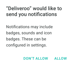
System dialogs convey important information related to the state of your app or the device, and often request feedback. An alert can consist of a title, an optional subtitle, one or more buttons, and optional text fields for gathering feedback.
- Use a system dialog solely for system related actions between your device and app eg. allowing notifications, social sign-in etc
Web

Mobile Web

iOS

Android
Basic modal
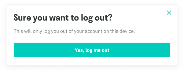
This is our default modal which contains buttons and a ‘cross’ icon in the top right. It can accomodate a title, subtitle, buttons and an illustration badge or full-width image (both optional)
- Use if you need to add an additional confirmation step to your task, or as a last resort to sell a new service
- The modal can be dismissed through clicking the cross icon, the dark overlay background and the CTAs
- Our buttons are positioned in accordance to backward/forward actions eg. Left side button is reserved for 'going back' actions such as Cancel while right side buttons are reserved for primary and secondary actions. On mobile, this would be top for primary/secondary actions and bottom for ‘going back’ actions.
- On mobile, the ‘cross’ icon is removed. Generally, there should be a button that will essentially cancel the modal.
Web

Mobile


Large (fullscreen) modal
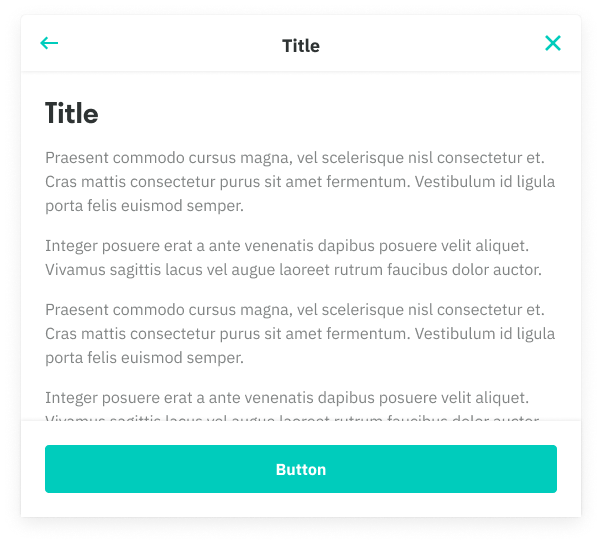
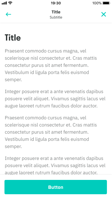
Our large modal is bigger both in width and height, allowing for significantly more content to be shown above the fold.
- Use a large modal if there’s extra content that requires more real estate and prominence
- A title and subtitle can also be used in the modal’s header, providing additional context. This title will generally be the same name of the action/row that initiated the modal.
- Large modals can be nested, thus allowing for additional navigational elements such as a ‘back’ icon.
- On mobile, the modal expands fullscreen, taking up the whole screen of the device
- Navigational elements such as the ‘back’ and ‘cross’ icon can be removed in certain cases
Web
Mobile
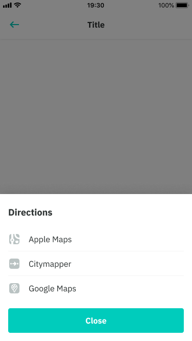
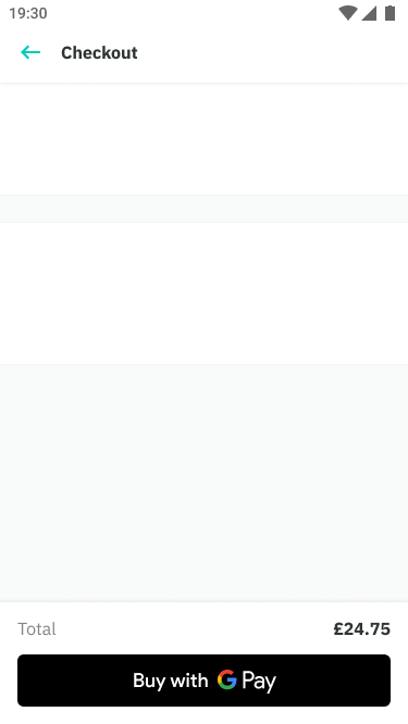
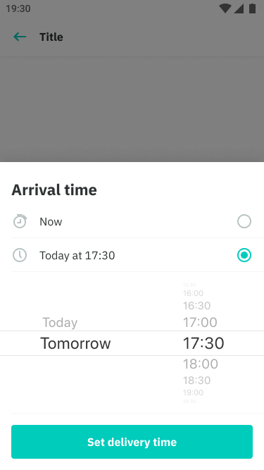
Bottom sheet modal
Our bottom sheet modal is a mobile-only flyup, that is commonly used across different mobile platforms. It can be used on Web, but will appear like our basic modal.
- Use a sheet modal when you require additional interactive elements such as a set of row actions, or for something more custom like checkout
- The modal can be dismissed through the ‘cross’ icon (web only) or the dark overlay background and the CTAs.
- The sheet is positioned at the bottom of the device and flys up beneath the device’s real estate.
Mobile
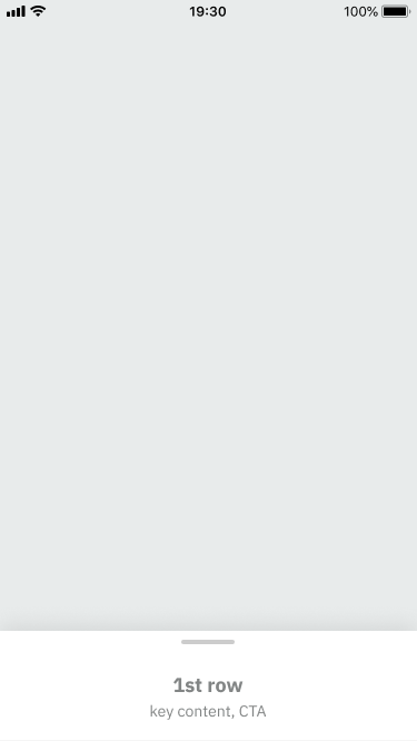
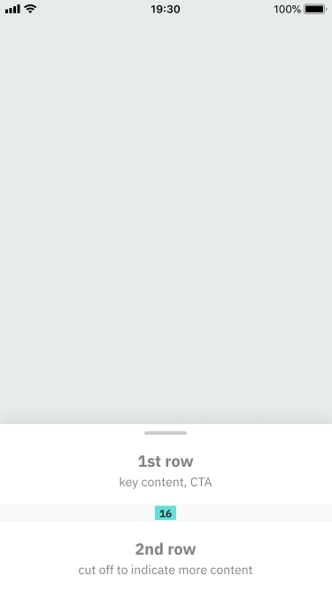
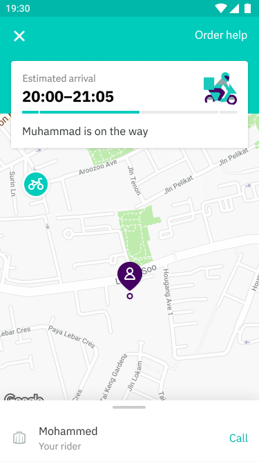
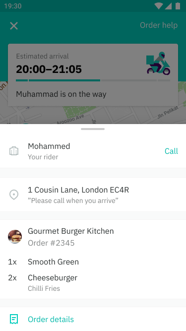
Bottom sheet drawer
Bottom sheet drawers are used to accommodate key/useful information information inside a draggable modal. These are mostly used alongside a much larger and prominent component eg. a map view.
Placement variations: always surface at least one row of content with a clear action eg. search input a list of restaurants or a rider about to go online
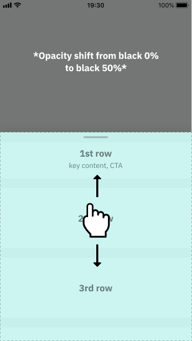
On swipe: the grab area is used to indicate that it is a moveable component but in reality, the entire modal is scrollable. On swipe, the opacity shifts from 0% to 50% black once it reaches it’s max height. In cases where important content at the top also needs to be shown, the opacity can be removed on a case by case basis.
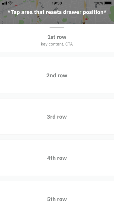
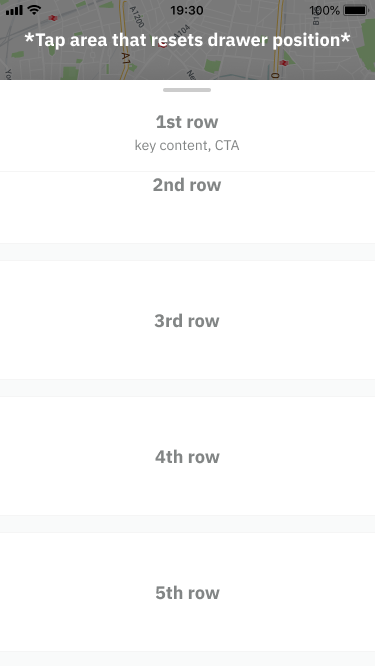
Max height: there must be at least 80dp gap from the top of the device. This keeps context on what was seen before and is also a tappaable area that will auto-collapse the drawer to its default position once tapped.
Below the fold: in cases where there is more content below the fold after reaching it’s max height, the first row and grab area becomes a sticky.
Mobile
Placement variations
Mobile
On scroll
Mobile
Max height
Max height: scroll
Mobile
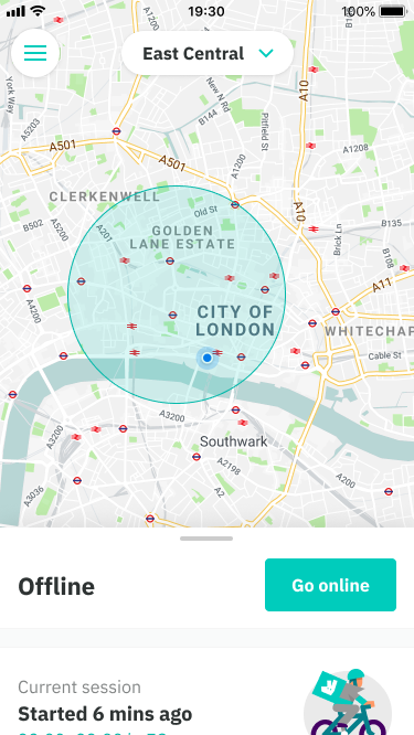
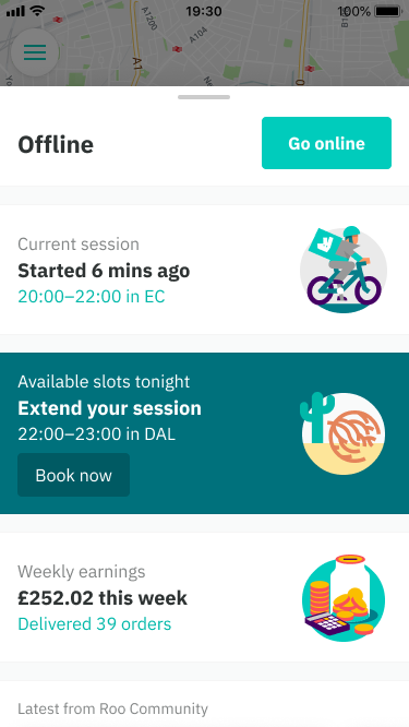
Rider Home use case
Mobile
Order tracker use case