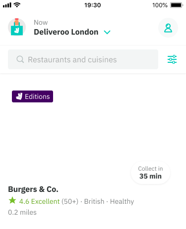
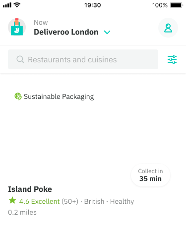
Tags are read-only components used to attract the customer’s attention to an element. They are mostly used inside our restaurant cards to indiciate a differentiator between other restaurants eg. an Edition’s restaurant. White and tinted tags are available depending on the background behind it.
Colors
There are a variety of styles available with no strict rules, although for best practice:
Grey - default tag suited to non-critical statuses
Red - use to callout critical information like errors, destructive actions (eg. removed), negative eg. cancelled order
Orange - use to call attention to something that is also non-critical such as ‘new’ or a warning
Green - use to call out something is either in a successful, completed or positive state
Aubergine - for Deliveroo Plus related content only
Some cases may require custom tags eg. ‘Editions’ or ‘Sustainable Packaging’ (experiment)


Best practice
- Reference well known representations of colors patterns eg. not using green tag when something is in a critical state
- Is clearly positioned beside or on top of the page element that they are related to.
- Concise text that is best kept to a single word.