Empty states are a key point in the user journey. They are opportunities to build rappot, drive engagement, educate or delight the user. Your empty states should never actually feel empty.
Best practice
- Use empty states when there is no data shown eg. first use, errors and cleared
- Ideally, they should explain the next steps the user should take and provide guidance with a clear CTA (optional)
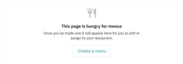
- First use: use when a person first interacts with the application or feature
- Cleared: use when a person has just completed a task, workflow, or has cleared all data associated with a large component
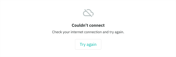
- Errors: use when a person has encountered a blocker during the interaction. It should be communicated in a way that is both helpful (what the error is) and makes sense (why it happened).
- The secondary button can only be used, we do this to avoid a clash in prominence with the page-level primary button
Do
Don't
Structure
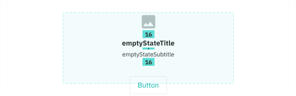
- Icon: 36 Large, any icon from material icon set can be used
- Title style: Body small bold
- Subtitle style: Body x-small
- Button: Secondary
- Padding: Large (24) top/bottom, horizontally centered to card
- Dimensions: 343w, 144h max...can resize for 320px devices