A row is essentiallly a highly customizable list item, used all across our products to accommodate many use cases. Default rows allow the inclusion of many actionable elements.
Anatomy
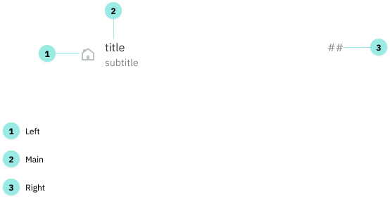
There are three areas that can make up a row: Left, Main and Right.
Variations
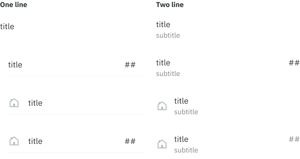
These three areas can be combined to create different variations.
Options
Left
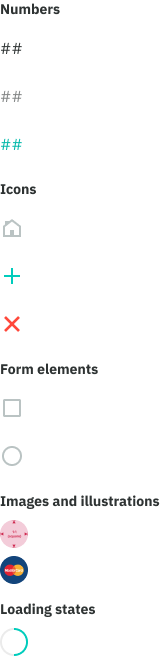
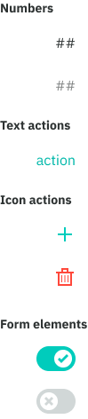
Numbers: primary, secondary, action Icons: decorative, action, destructive action Form elements: checkboxes, radio buttons Other: circular images, illustrations and loading states
Main
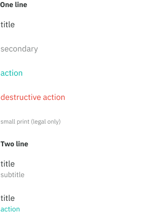
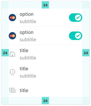
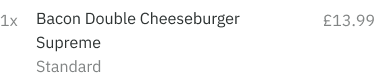
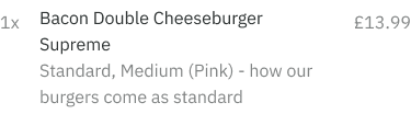
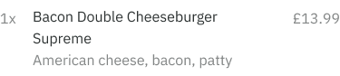
Text-only: primary, secondary, action, destructive action, small print. A subtitle (secondary, action) can also be included making it a two line row.
Right
Numbers: primary, secondary Text: action Icons: action, destructive action Form elements: switch/toggle
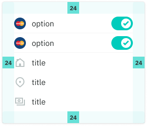
Spacing and padding
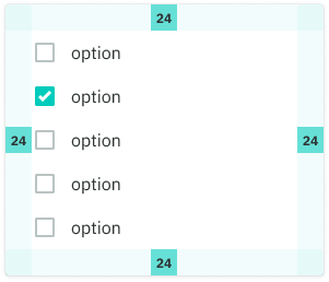
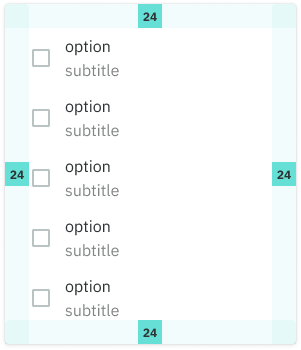
Without right accessories
- 24px padding (when in cards)
- no dividers
With right accessories
- 24px padding (when in cards)
- use dividers
Good to know
Text wrapping
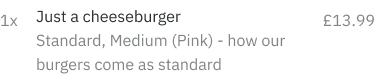
There is no truncation for title and subtitle text today, this is because we need to display the entire menu item in many places such as order history and checkout screens.
Numbers positioning
The ‘right’ numbers are top aligned (in Left + Main + Right) in order to align with the menu item inside a user’s basket. This improves the scannability from left to right.
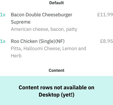
Default vs content rows
Use a default row if you wish to include actionable elements. These use a taller row height to accommodate tap area standards.
For rows of read-only data having a condensed view is useful for packing information. In this case, use a content row.

Multiple lines
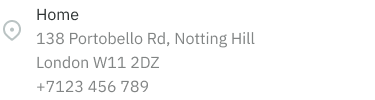
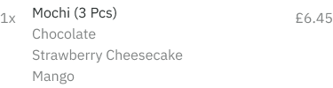
In certain cases additional lines might be used such as displaying a user’s delivery address, dishes in a checkout screen and previous order details.