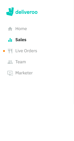
Our primary means of navigation is through a sidebar which contains a set of links that allow you to move between different sections of the application.
Color themes
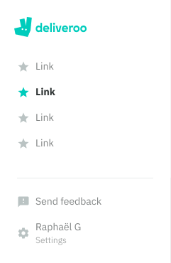
We use two set’s of themes to differentiate between an internal and an external tool.
Internal - dark theme, not available to customers eg. Restaurants Admin, Customer Support
External - white theme like our Consumer apps, available to customers eg. Restaurant Hub
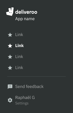
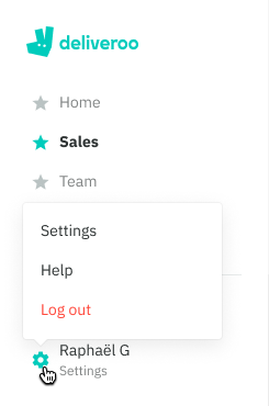
Bottom area
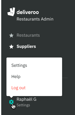
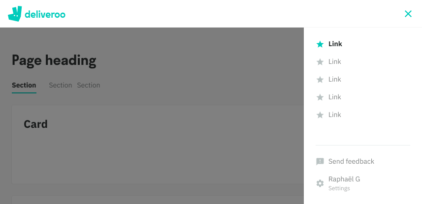
This area is used for global actions that do not relate to a section, such as a person’s settings or for sending feedback.
- Because of this, it is positioned to the bottom and seperated with a horizontal divider.
- For links that relate to different sections of the application, keep inside the top area.
- App name, user name and log out action are baked in to the sidebar. They can’t be removed.
Responsive
Once it reaches tablet breakpoint, it is hidden behind a ‘hamburger’ menu icon. It can be dismissed by tapping the ‘close’ icon.
Tablet (540-960px) - Sidebar appears on the right side, on tap
Mobile (0-540px) - Sidebar appears as a full screen menu, on tap
*Note - Some apps have not updated to the latest component library version and may still have collapsed sidebar version at the tablet breakpoint
Mobile Web
Tablet
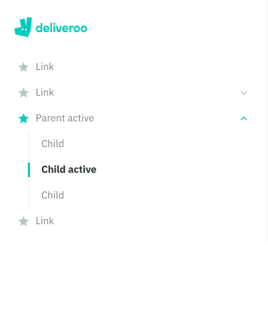
Nested links
Overtime, as more sections get added to the application it will logically make sense to group these under one section.
- A nested link is differentiated from a standard link by including a chevron on the right, clicking the entire row will expand the parent to reveal it’s child links
- When using nested links there should be at least two child links available
- Unlike a standard link, when active the focus is on the child link using a teal chip and a more emphasised text style. The parent icons retain an active state.
- If many parent sections have been expanded, and you click on a child link, only that parent section will remain collapsed when it loads the new page.
Badges
Badges can be used to indicate a change of state inside a page at a very high level.
- There are 4 states to choose from: success, warning, error and info.
- Best used when there is a process running in the background such as gathering live data, a creation process that takes considerable armount of time.
- Example today: Live Orders in Restaurants uses this for Web Rom to indicate when new orders have come in.
*An enhancement is coming shortly that will in include a number.
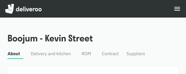
Inside a section
There is also secondary ways of navigating, particularly inside a section through the use of back links, tabs and pagination.
Back links
A back link sits above the content header allowing you to quickly get back to a related parent section. Back links should only appear when inside the page of a child link (sub-section).
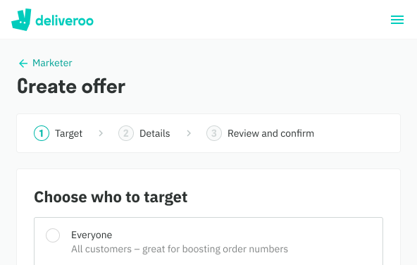
Tabs
Left-aligned horiztonal list of links that allow you to group and view content at the same level of hierarchy without navigating to a different section.
- Minimum of two tabs
- Tabs can overflow and allow horizontal scrolling
- Shoud be clearly labeled to help differentiate between the sub-sections, ideally one word
- Should not be used as a means of jumping back and forth to complete a single task
- Figma Tip: Padding is built into the component, when changing a tab’s name resize until the text wraps, that will be it’s true size
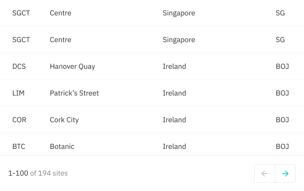
Pagination
Used inside Tables, pagination let’s our users move through a collection of items that has been divided into many pages. More documentation available inside the Tables frame.