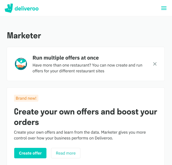
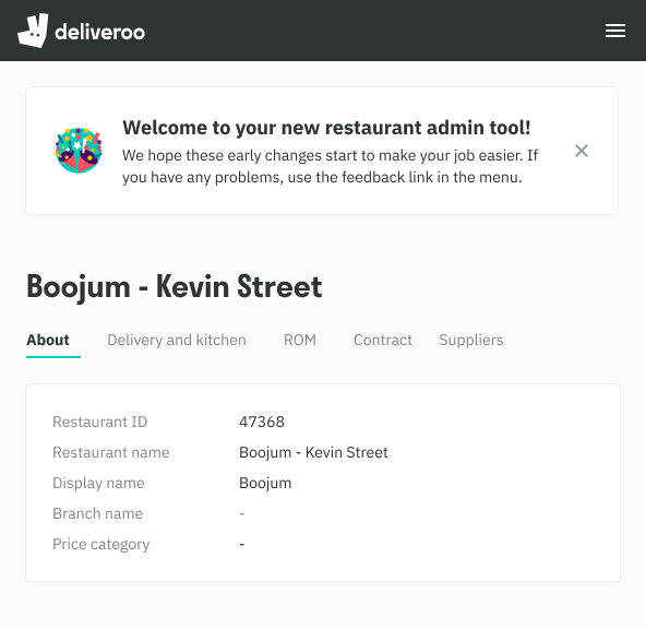
Similar to PDS’s Service Banner we use a page banner to communicate a key message that is placed directly below the content header aka at page level. Illustration badge is optional.
Intent
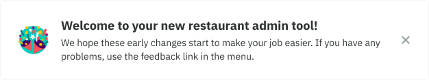
Best practice: communicating a key message such as upselling a new feature, ‘welcome’ or something that is crucial to that page, ideally with a clear CTA.
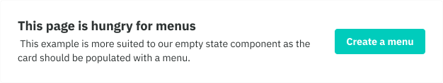
Bad practice: communicating a message of lesser importance or misuse of component such as content that is more suited to an empty state or incorrect button positioning.
Do

Don't

Actions
- It is best practice to include a vertically centered primary CTA, based on the banners being placed so prominently.
- If the banner is conflicting with other primary buttons on the page, then a secondary button can be used instead
- In cases where that may not be applicable such as a Welcome message, use a dismissive action eg. ‘cross’ icon instead.


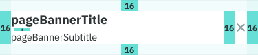
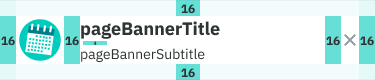
Structure
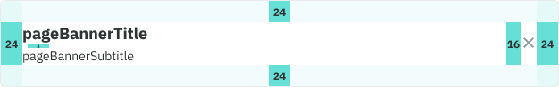
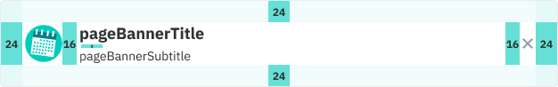
- Desktop spacing: padding is set to Large (24)
- Mobile spacing: padding is set to Medium (16)
- Type: title is set to Heading X-Small and subtitle is set to Body Small
- Illustration: badge size is set to 48
Web
Mobile Web
Positioning
- Standard: Page banners are positioned above all cards, placed directly below the page’s content header because of their required intent of communicating a key message.
- Edge case: in situations where there are navigational elements below the content header, or the message is tailored like a ‘Welcome’ message, then it should be placed above the content header.
Standard
Edge case