Design tokens are a technology-agnostic architecture and process for scaling design decisions across multiple platforms and devices, including native, and more.
Design tokens consist of both a name, and a value—both of which are required. They store visual design attributes (colors, text, elevation, etc.) instead of hard-coded values (such as hex values for color or pixel values for spacing). This approach maintains a scalable and consistent visual system for UI development. At Deliveroo, design tokens serve two purposes:
- Centralising our foundations to ensure that all our platforms an services are pulling from a single, central source of truth.
- Codifying design decisions through semantic naming, so that design and development can speak the same language.
Types of design tokens
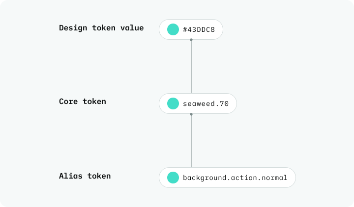
There are three different types of design tokens, which build on one another:
- Core tokens have a value that express a specific color.
- Alias tokens (aka 'semantic' tokens) add a layer of abstraction and meaning, and they reference core tokens.
- Component tokens are used specifically within components, and they reference semantic alias tokens.
PDS 2.0 uses semantic alias tokens, but we might also refer to them also as design tokens interchangeably.
Alias token taxonomy
Alias tokens describe the context of how and where a token is used. For example: background, foreground (for text and icons) and border. They reference core tokens. The alias token taxonomy is the order in which all properties of a color’s function are declared.
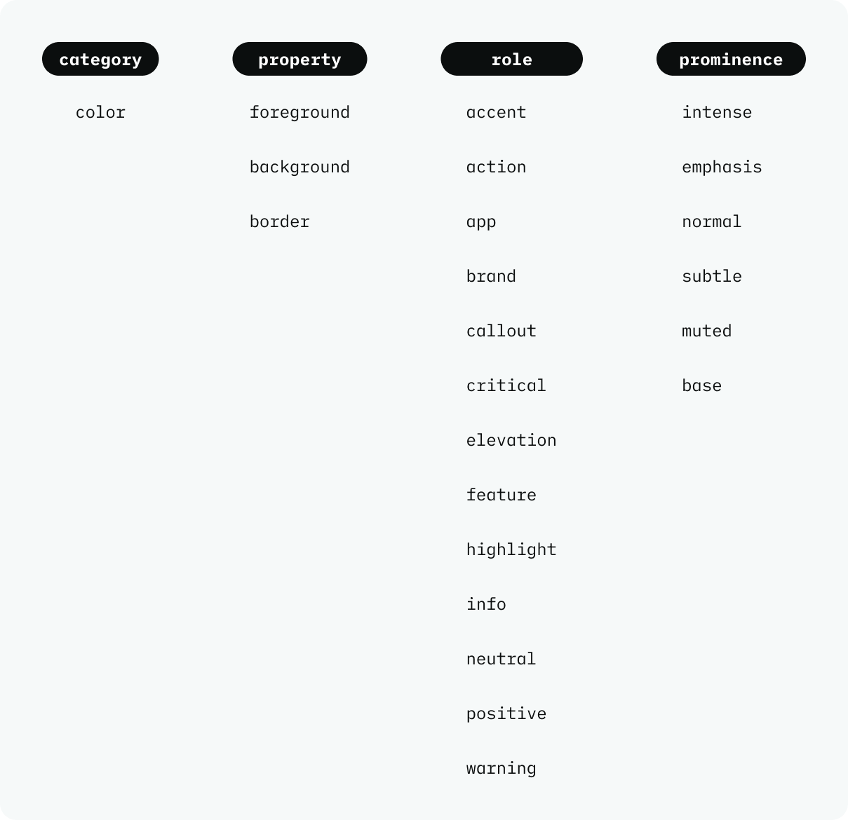
The naming convention for design tokens has four levels with different declarations:
- Category. A category is the top-level grouping to which the token type belongs. For example, colour, type, spacing, etc. This example illustrates colour.
- Property. The property desciptor states where the token is used within the UI. For colour, the property can be background, foreground or border.
- Role. A role refers to the intention or context of the token's usage. There are fourteen different roles defined for colour tokens.
- Prominence. The prominence descriptor refers to the different colour variants within the role. Prominence accounts for different levels of luminosity, with 'normal' being the baseline prominence. Prominence goes from muted (lowest prominence), to subtle, normal, emphasis and intense (greatest prominence).
Naming structure
The naming structure of tokens is dependent on the platform in which they are being used. Each token structure matches how the platform would expect its variables to look like.
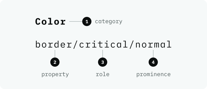
For example, in Figma, alias tokens are stored as variables, and a forward slash is used to separate the token levels and the colour category is implied as illustrated below.
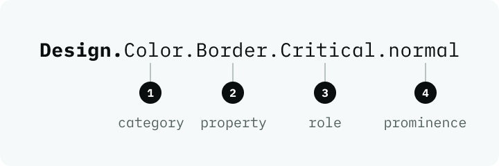
In iOS, the naming structure is a bit more verbose and specific. Each token starts with 'Design,' then proceeds into the four token levels as illustrated below.
Property explained
Our alias tokens are grouped by property first, which refers to the UI element you’re applying colour to:
- Background
- Foreground
- Border
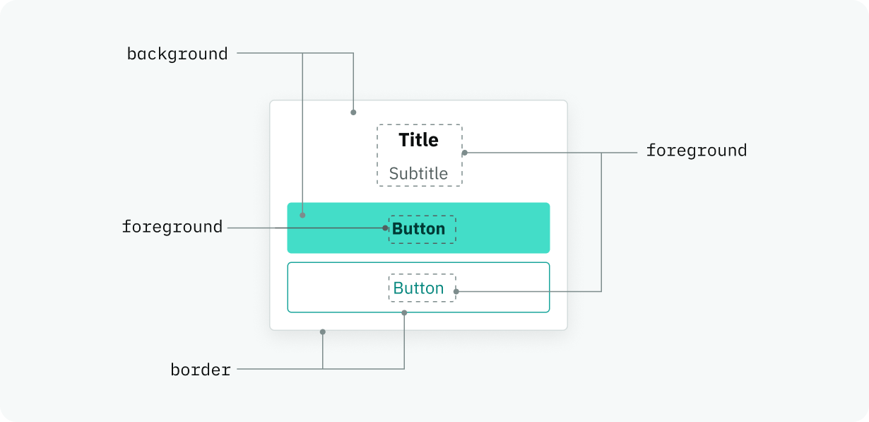
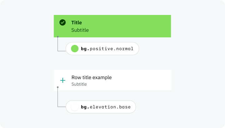
Background
Is the area behind your main content. Apply to backgrounds and surfaces of components and containers.
Abbreviated alias naming used Figma and the examples below: bg
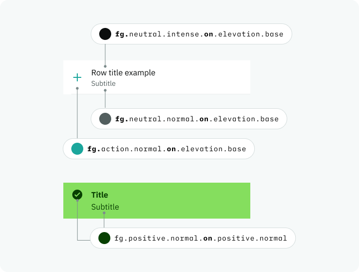
Foreground
This is applied to text and icons. The foreground property has an on keyword that connects it to roles. It enables us to generate accessible colour pairings, given a background role. On values are calculated based on each role, so you can safely pair any color.background.[ROLE] with its corresponding color.foreground.on.[ROLE].
To refer to an on colour, we need to be able to reference both the background it is on, and the type of foreground we want. This results in the following color token naming convention: [ROLE].[PROMINENCE].on.[ROLE].[PROMINENCE]
Abbreviated alias naming used Figma and the examples below: fg
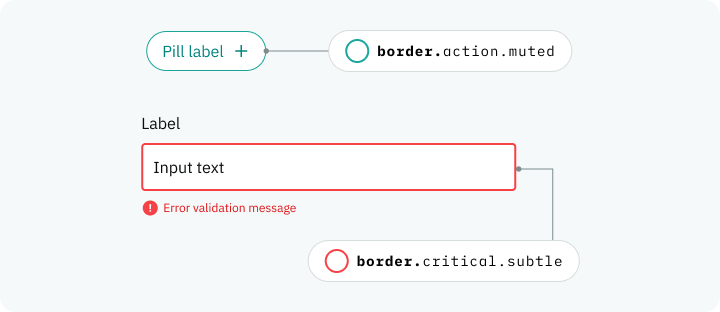
Border
Also know as strokes or outlines in design. Use this property for components like text input, pills, secondary buttons and standard borders.
Colour accessibility
All foreground elements (text and icons) and any UI element that are necessary for a user to successfully use our product must have sufficient contrast against the background. Every property has baked in the colour contrast ratios necessary to meet WCAG 2.1 Level AA.
Colour contrast requirements
- 4.5:1 For all text elements smaller than 24 px
- 3:1 For non-text and any UI elements like icons and graphic elements that a user needs to interact or understand it to fully use our products.
- 3:1 For larger text that it’s 24px or bold 19px and larger.
- Decorative images and disabled states don’t have contrast requirements.
More color token resources
Ask for help in our dedicated color-tokens-support channel. Please send a screenshot of the specific UI you need help with and we will get back to you as soon as possible.
For designers
- Design tokens in Figma. A handy guide to help you understand color tokens, which are called variables in Figma.
- PDS 2.0. Color tokens baked into our product design system components for easy use.