Cards are used to house the majority of content inside our page layouts. Similar content and tasks should be grouped together to make things easier to scan, read and take action.
Basic Variations
Since cards are a container, they can include practically anything. But at a basic level it is made up of: Body text, headings, buttons, dividers and loading states. Loading states only occur when it requires fetching a variable from the backend eg. waiting to populate a form based on someone's pre-filled information or the status of something


Spacing and padding
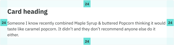
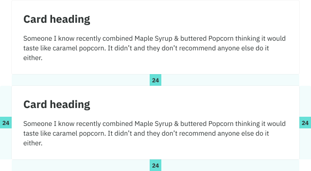
By default we use our large (24) spacer as inner padding for cards, as well as between card stacks. Medium (16) is used on mobile.
Content layouts
Content layouts are made up of columns and sections to help structure your information in the most optimal way.
Columns
Columns create the main layout of a card. These come in three main choices: 1 column , 2 column and 3 column. 4+ would be used on summary cards only.
Sections
- In cases where you need to break out two related but similar pieces of information, use a section header as a way of introducing that content while maintaining a sense of hierarchy.
- Dividers(with built in padding) are used to help with this seperation of content. In cases when no divider is used, apply our Medium (24) spacer.
- 1 column is the default
- Combinations: You are free to use any combination of layouts within same card eg. 1 col first, divider, 2 col to 1col.
Best Practices
Headings
Headings should be concise and informative, outlining the card’s intent.

Hierarchy
Prioritize content so the person’s most important information comes first while also using sections and divders where appropriate, to create a sense of hierarchy.
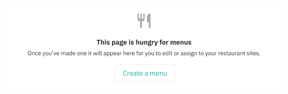
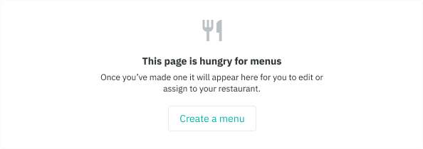
Empty states
Empty states are a key point in the user journey. They are opportunities to build rappot, drive engagement, educate or delight the user. Your empty states should never actually feel empty.
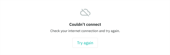
- Use empty states when there is no data show eg. first use, errors and cleared
- Ideally, they should explain the next steps the user should take and provide guidance with a clear CTA (optional)
- First use: use when a person first interacts with the application or feature
- Cleared: use when a person has just completed a task, workflow, or has cleared all data associated with a large component
- Errors: use when a person has encountered a blocker during the interaction. It should be communicated in a way that is both helpful (what the error is) and makes sense (why it happened).
- The secondary button can only be used, we do this to avoid a clash in prominence with the page-level primary button


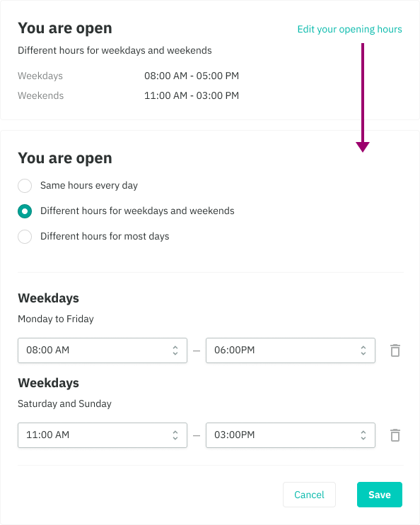
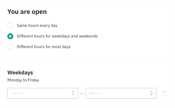
When using forms
- The upper right corner of the card can be used for persistent, optional actions such as an Edit link
- The bottom of the card should be used for next step CTA’s, keeping the buttons to as few as possible while maintaining a single primary action