Progress steps is used in forms to break out the content in several seperate pages, while giving context as too many steps are required to complete the form.
Structure
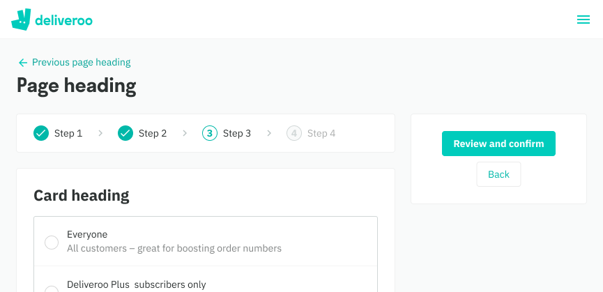
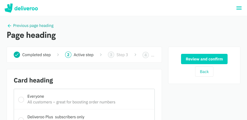
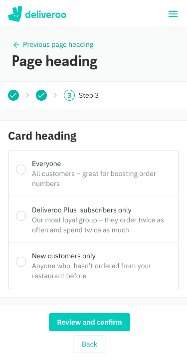
Progress steps has 3 different states:
- Complete - a step that has already been completed
- Active - visible step that is currently being interacted with and
- Default - step that has not been seen by the user yet
Best Practice
- The number of steps is best suited between 2-5 steps
- Keep step labels short and concise, ideally a single word if possible. This also helps with translation and minimizes overflow cases
Web

States

Outer padding

Inner padding
Mobile Web

States

Outer padding

Inner padding
Behavior
- Component is read-only, back and forward actions are done with seperate buttons inside an aside page layout
- Desktop Web: every step’s label is shown
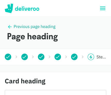
- Mobile Web: only the active step’s label is shown, the rest are hidden due to smaller device widths
- In cases of overflow, the last visible step is truncated
- Live examples: Marketer (Growth)
Web


Mobile Web

