A component that is made up of multiple items in a list aka a list item. Today, we have a Definition List and a List component. There can only be one column of data.
Defintion List
- Displays a list of paired items that is read-only.
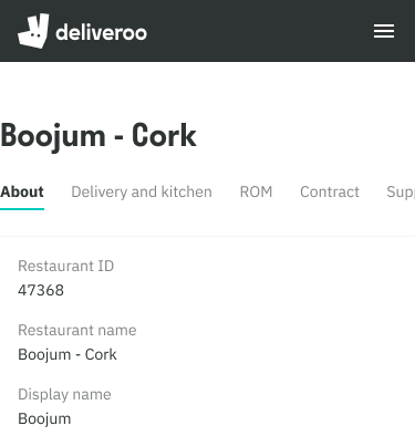
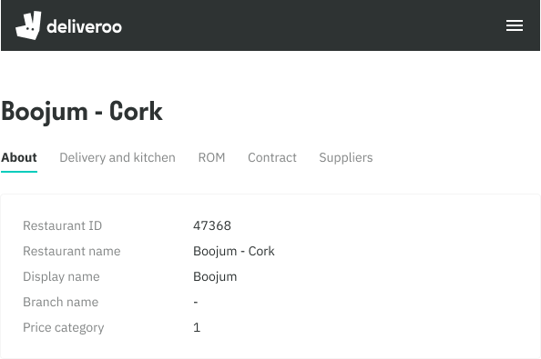
- Useful for showing read-only data in forms or a summary of information eg. About card of a restaurant site.
- By default the content is left aligned, but can also be top aligned or have custom widths applied to the definition list.
- On mobile, the items stack below one another
Mobile Web
Tablet
List
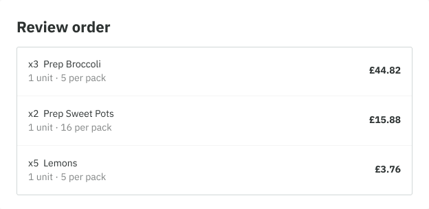
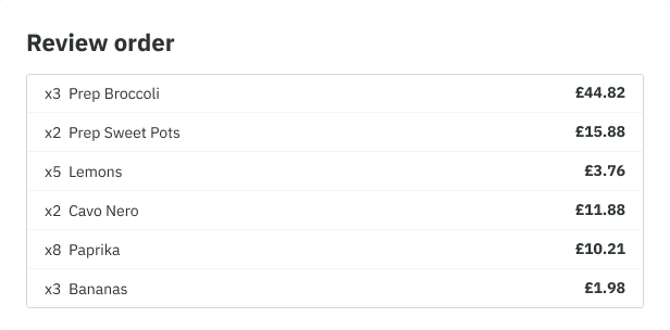
- Our lists have two height variations; Compact and Default. Compact variation would be more suited to larger lists or cases where only text is used.
- A subtitle can be used to give more context to the list item.
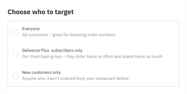
- Form elements can be included on the left of our list items usually for when a list requires a selection to be made, such as a checkbox or a radio button. The right side can technically include anything, although it is mostly used to surface the cost of a menu item, or a navigational element such as a chevron icon, or sometimes both.
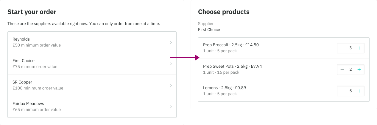
- Navigational elements such as a chevron icon is used to drill down within the list eg. restaurants purchasing food through RS Admin. The content is significantly different and would not be suited for nesting.
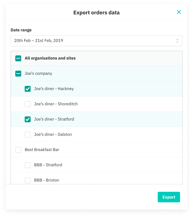
- Nesting can be used to represent tiered information and is mostly used when several selections need to be made eg. selecting many sites from a range of organisations, where the content and actions are very similar from each other.
Default
Compact
Form elements - Create Offer (Marketer)
Navigational - Food Purchasing (RS Home)
Nesting - Exporting Sales Data (RS Home)