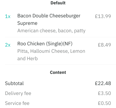
Unlike default rows, these are more compact with less functionality with the primary focus packing read-only information together, such as summary totals in a user’s basket.
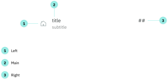
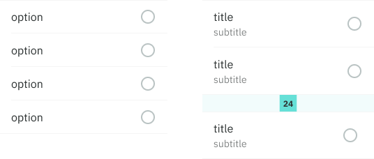
Anatomy
There are three areas that can make up a row: Left, Main and Right.
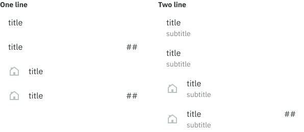
Variations
These three areas can be combined to create different variations.
Options
Left
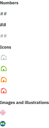
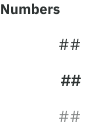
Numbers: primary, bold, secondary
Icons: decorative, feedback related (success, error, warning)
Other: circular images and illustrations
Main
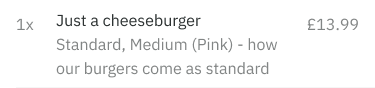
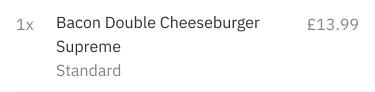
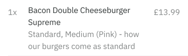
Text-only: primary, bold, secondary, action, feedback related
A subtitle (secondary only) can also be included, making it a two line.
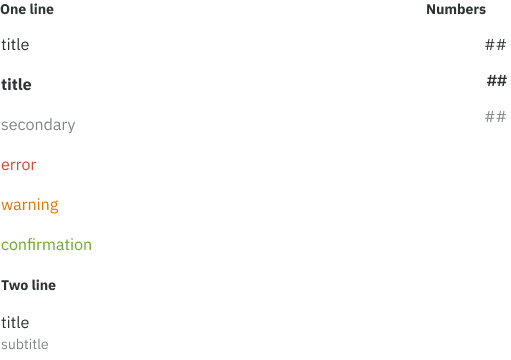
Right
Numbers: primary, bold, secondary, action
Spacing and padding
Android - section
- + section divider (8dp top/bottom)
- + top/bottom 8dp padding
- - no margins inside row
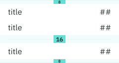
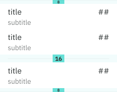
iOS and mobile web - section
- + row dividers
- + section dividers
- - no top/bottom padding
Good to know
Text wrapping
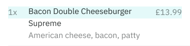
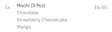
There is no truncation for title and subtitle text today, this is because we need to display the entire menu item in many places such as order history and checkout screens.
Numbers positioning
The ‘right’ numbers are top aligned (in Left + Main + Right) in order to align with the menu item inside a user’s basket. This improves the scannability from left to right.
Multiple lines
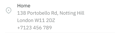
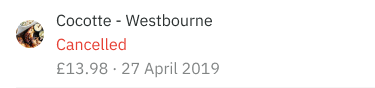
In certain cases additional lines might be used such as displaying a user’s delivery address, dishes in a checkout screen and previous order details.
Default vs content rows
Use a default row if you wish to include actionable elements. These use a taller row height to accommodate tap area standards.
For rows of read-only data having a condensed view is useful for packing information. In this case, use a content row.